
SUMMARY
How we turned the technical need to update the checkout solution into an opportunity to also improve the experience and generate a 21% improvement on the conversion rate.

Before (left) and After (right)
My role
Digital Product Designer
squad
Digital Product Designer
Product Manager
4 Developers
Deliverable
A redesigned checkout experience for Patagonia.com and regions
Timeframe
August - December 2021
Context
Based on Salesforce Commerce Cloud, Patagonia’s legacy checkout was dated and needed updates that would break all the customizations realized in the past. This also represented an opportunity to improve an experience that had bugs, was slow, full of unnecessary steps, confusing, and with some security concerns. As according to Scandiweb, on average, 75.8% of customers abandon their carts due to one or more of these issues, so the potential was not only to be able to have the latest version running but also improve our conversion and reduce cart abandonment.
Landscape analysis
Knowing that the checkout process is something common across all e-commerce sites, we decided not to reinvent the wheel. So we started by taking a look at the landscape. We looked at 10+ e-commerce websites, and bucked them into the two possible patterns: Accordion and 2-Step Checkout.
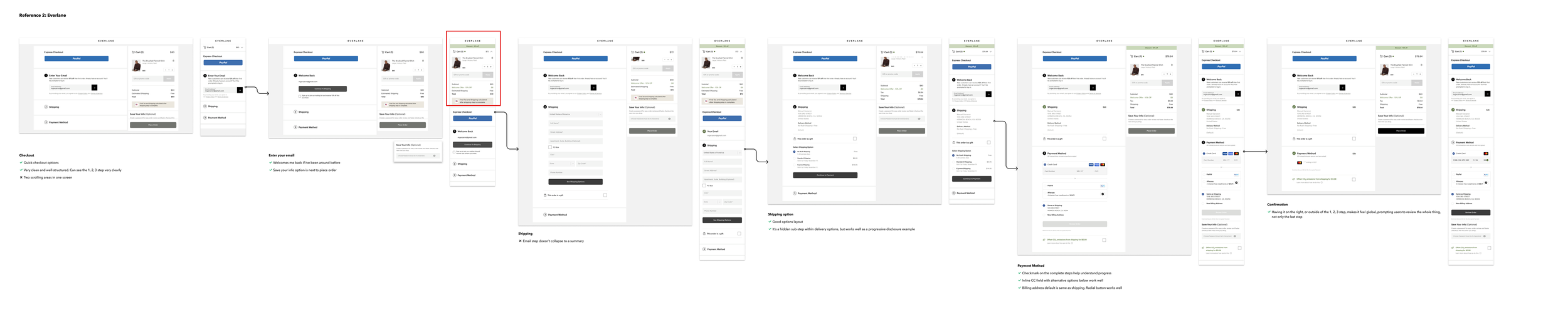
Lanscape analysis example: Everlane.com
Accordion-type Checkouts
Accordion is the type of checkout that has all the steps in one page with each of them expanding as the user fills the previous one. The advantages of this type is that it is compact, you can have same-page edits (no browsing back) and it’s is the closest to the Salesforce Commerce Cloud out of the box solution. The cons is that it is more complicated to setup data tracking since all happens on one page, and there is a small risk of not matching the browse back expectations from the customers. Some of the brands using it that we deeply analyzed are Nike, Levi’s, Everlane and Aesop.


2-Step Checkouts
This type of checkout basically divide’s the flow into two separate screens. While that visually help’s customers understand where they are through a usually used horizontal progress bar, it does present some challenges. For instance, if the user wants to review or edit entered data, they have to go back to the previous page, causing some extra loading times and data losses. Also, the form can be perceived as more complicated and longer for some users. Finally for our case, this type of checkout was further away from the out of the box solution from Salesforce Commerce Cloud. Brands like Marine Layer, Faherty Brand, and Taylor Stitch, all using Shopify were at the time using this type of checkout.
Baymard Institute’s Insights
According to Baymard Institute, an often reference for our team, while there was no statistical data on the most popular and best-performing checkouts yet, there was an observed trend towards accordion checkouts. Some of their findings we considered:
The % of accordion style checkout usage grew from 14% in 2012, to 32% in 2016
“While an accordion checkout often is an aesthetically pleasing option, our past 9 years of large-scale checkout testing have not found that accordion-style checkouts consistently perform better than either traditional multi-page checkouts or one-step checkouts. “
“What we observe to be much more important to checkout UX performance is what users are asked to do during the checkout flow, and how they are asked to do it.”
75% of accordion checkout flows have major usability issues as they fail at one (or both) of these two pitfalls:
Deprive users of an ongoing review (which is the main benefit of an accordion-style design), and / or
Break user back-button expectations (often with data-loss as a consequence).

At GAP, previous checkout steps collapse into summaries, allowing users to review their input as they progress.
Example of infographics done for internal review
How we were doing
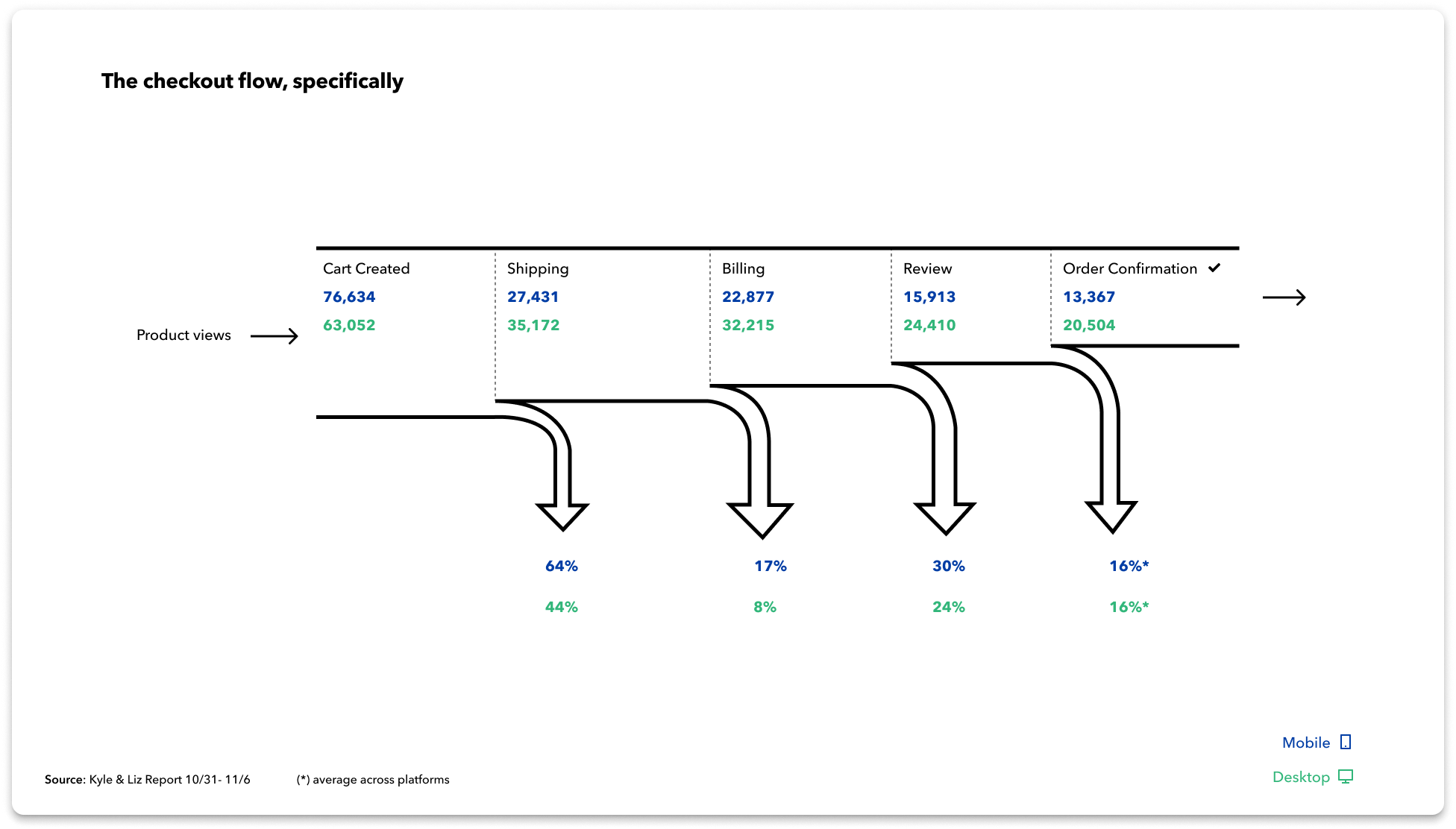
To set a reference point to see what happened after the implementation, we analyzed data for a week using Adobe Analytics. Our conversion rates were 1.99% for Mobile and 4.05% for Desktop, not bad compared to industry benchmarks of retail US e-commerce (according to Kibo Commerce): 1.6 - 2% for Mobile and 2.1 to 3.7% for Desktop for Retail e-commerce conversion rates in the US. But, for a renowned brand like Patagonia, which has an overall very positive image, we knew that that number could be improved.
Design Process
Even though the lack of solid evidence of one being better than the other one, given the observed trend and proximity to the out of the box solution decided to opt for the accordion type of checkout.
During the process, I went from low to medium and high fidelity, adding as many design critique sessions and reviews with product owners and developers as possible. We also hosted recurring reviews with stakeholders such as the different regions, customer experience representatives, data and cybersecurity analysts. In a process that went over 5 months of constant design, reviews, iterations and development we launched in November of 2021.

Low fidelity wireframe example
Conclusion
Even if it was not technically feasible to run an a/b test, ramped up implementation to track impact side to side, we observed an improved conversion of 21% comparing the same period year over year. Considering 2021’s traffic and average order value, this could be translated on an early positive impact of over +63M$ in yearly revenue, only in the US.
Finally, as a team we learnt a lot on how to work together across disciplines towards a common goal, offering each other constructive feedback and iterating rather often than designing too much before passing over to developers. We improved a lot internally from the learnings of this project.
High fidelity prototype of new checkout flow for Patagonia.com and regions