
ABOUT
With the mission of bringing the brand to the US market, we are re-imagining its value proposition to stand out from the competitors.

Team
Victoria Sato: partner, operations
Who Knows Agency: online marketing, development
My Role
Founder & creative direction
UX/UI design
Product line strategy & management
Qualitative and quantitative research
Time and Place
June 2020 - current
Buenos Aires / Los Angeles
About the company
Tincho & Lola is a brand of soft goods responsibly made in small runs in Buenos Aires, Argentina.
With the opportunity to recycle old sails into accessories, and the mission to start a brand that could inspire better consumption habits, I founded Tincho & Lola back in 2012.
Through the years, it evolved from being a material-centered company to a maker-centered company.
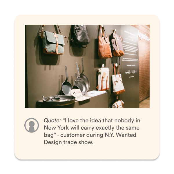
• Sold in SF-MoMA
• Participated in Wanted Design NYC
• Hosted in main media in Argentina
• Sold in 4 countries
• 5 employees
• Work with 4 artisan partners
• 14K Instagram followers


Some numbers
Internal records:
Growth from initial 20 to current 500 monthly units
Product: 60% backpacks / 20% totebags / rest accessories and others
Channel: 40% corporate / 40% b2c / 20% wholesale
Market: 95% argentina
Analytics
3k monthly web visitors
Location: 84% Argentina / 8% US
Device: 76% mobile / 23% desktop / 1% tablet
Gender: 80% female
Age: 30% 25-34 / 18% 35-44 / 18% 15-24

The challenge
HMW bring an accessory brand to the U.S. and make a difference?
The quick answer to this is by telling a story. But picking the best story to tell was not an easy task. This whole design process is being done in order to define the best story to tell.
Needfinding
Qualitative
Over the 8 years that the company has existed, we’ve been very active when talking to our customers and understanding what they value from our proposal, and what we need to work on. These are key findings from conversations in our studio or in tradeshows, a great way to gain exposition to people alike.


Quantitative
Besides from what we have learnt from the years, we also wanted to take this opportunity to learn as much as possible from our current customers. So we prepared a survey using Typeform and sent it out through Mailchimp to our data base of over 1700 people who either have already bought from us or decided to sign up for our e-mails. In that survey we asked people first about their knowledge and care-level about backpacks. In the second part, most important, we asked them about their last experience with us: what we did right, what we did wrong and also what they wanted to learn more about: how we make the products, who makes them and whats our environmental impact. Here are some of the results.

Big Picture - Out of the 1700+ emails we sent out, we reached out free Typeform account limit of 100 in less than two hours. Besides from analyzing that data, we used as a recruiting tool for in depth interviews + feedback sessions.

What they care about
Even if we cannot draw definitive conclusions, we learnt that they mostly care about the environmental impact. This was easy to predict, as what we offer different from competitors is that that is our focus. We also read really good ideas and insights in the responses which we will use for future improvements in the experience.
Ideation
To enter de competitive market of the US we knew that, on top of making awesome and top quality products, we had to bring an appealing story. Pulling insights from our needfinding process we knew that there were three ingredients that needed to be in it.
Meet the Maker: The story of the maker behind the bags
One of a Batch: The story of the whole process behind it, and limited nature of the way we work
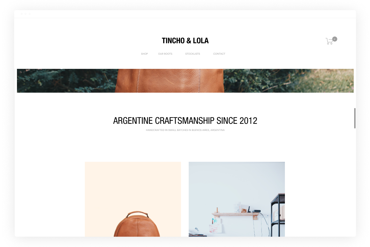
Argentine Craftsmanship: The story of where they’re made: Buenos Aires, Argentina
As well as our environmental impact, we knew that the cultural heritage of argentina had to be across the whole experience, in a cross dimension.

Concept testing
Developing these concepts, we came up with two ways of organizing our user experience, and their corresponding low-fi prototypes for user testing:


Variant A
An interaction model centered around our way of producing: in small runs that are changing one of another.

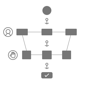
Variant B
An interaction model centered on the artisan makers we work with. We would become sort of a platform that connects them and their creations with the customers, enhancing their visibility
Feedback sessions conclusion
We showed these concepts to the three users we interviewed to learn from their point of view. It was a rich experience to gain learnings we were not expecting. In conclusion, even if they considered the makers an important character of our story, they found that the experience organized around them was confusing. They should be in a deeper level of the journey. On the other hand, they liked the game-like feel of shopping by batch, and how it communicated the limited aspect of our work. But it still needed way too much clarification and development.
Pre-order feature
Aligned to the concept of one of a batch, and responding to the fact that customers love being able to order before a batch is finished, we designed the feature that allows them to do so digitally as well.

User Wireframe for pre-order feature
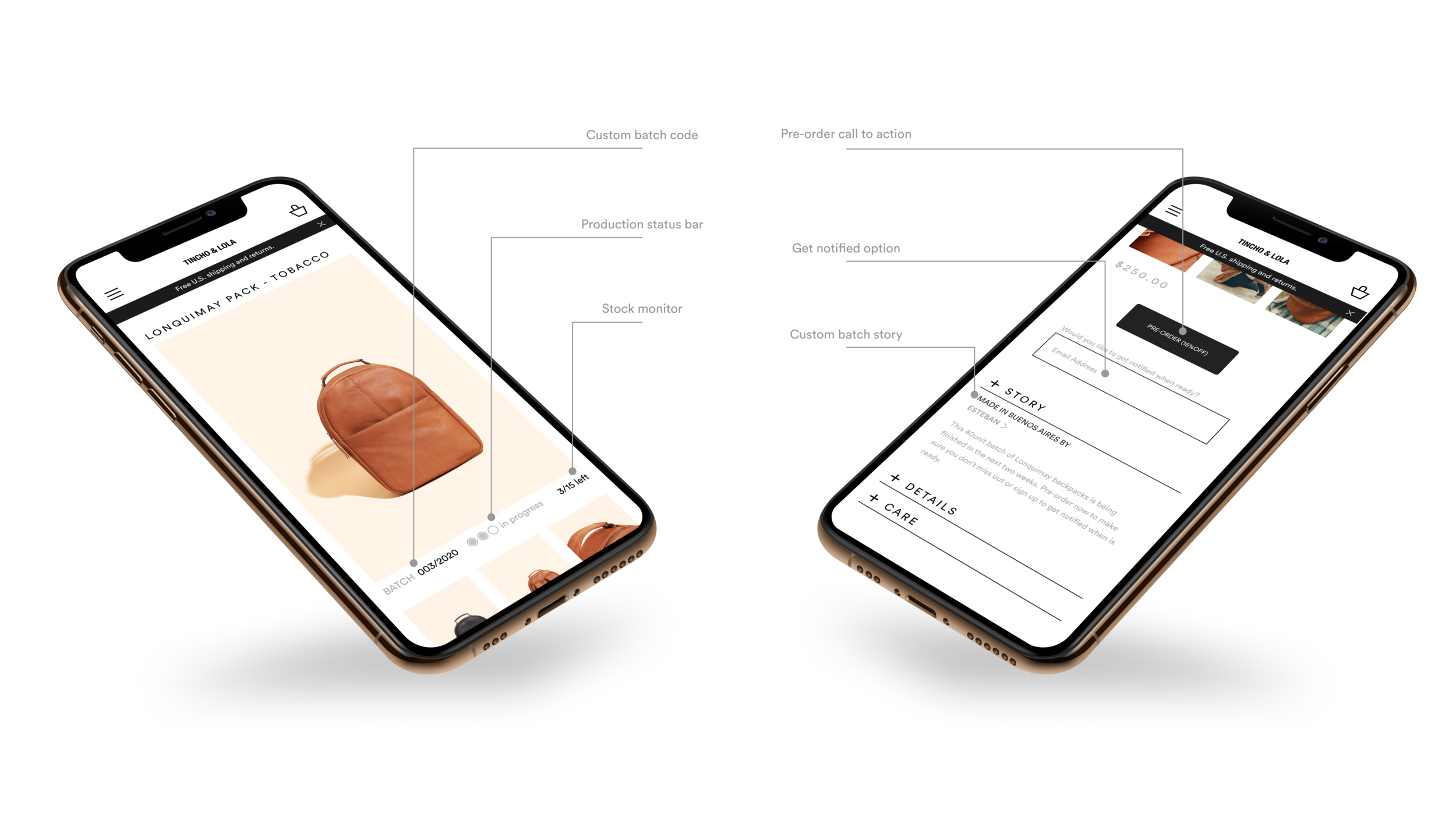
Mock up example for product page
Maker Cards
Leveraging the insight of Meet the Makers, another feature we came up with to introduce to our experience are the makers cards, through which the users can swipe through and see the people involved in the process, learning about the technique in which they work and see the products that they make. I came up with a first version and after a review with a colleague, I made an iteration:
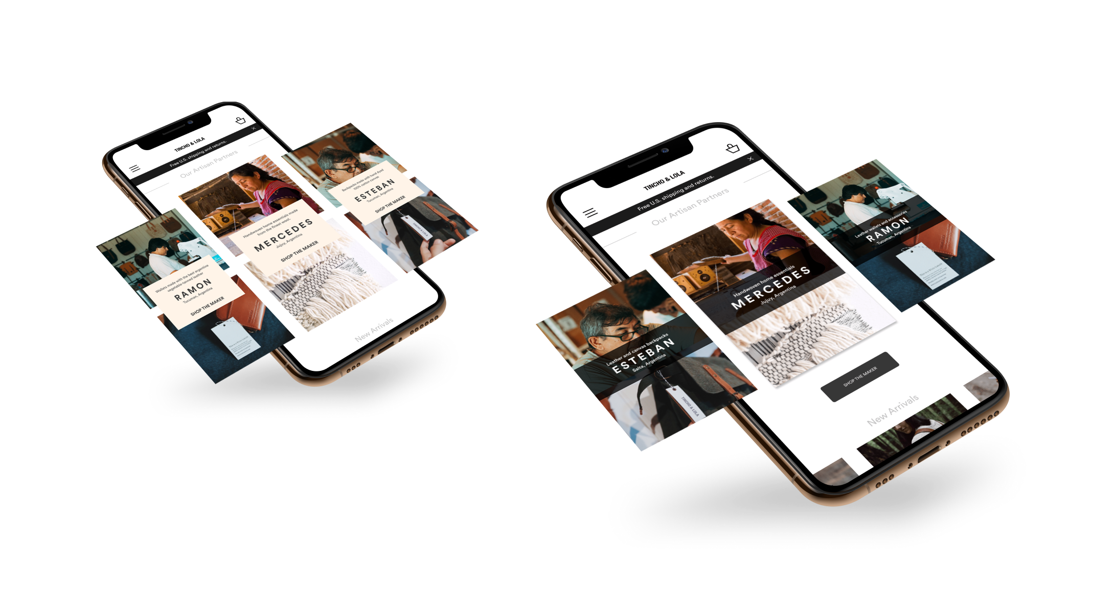
Maker cards: version 1 (left) and version 2 (right)
Made in Argentina
Part of the story that the products bring is the cultural value of the place where they are made: Argentina. The Patagonian region, the farmlands, the city’s cultural values such as Tango music, or the andes are just examples of values that the country has to offer. These values are part of our inspiration and what we want to communicate through our designs, our shopping experience or our social networks.
Makers bio page
From every product page, users will be able to connect with the maker through their story in their bio page.

