In short
Leading a strategic typography overhaul: How I replaced a commercial typeface with a bespoke brand font, using the transition to refresh our visual language and optimize core component performance across the ecosystem
My Role
Design Systems Lead
Rest of team
Front End Engineering Lead
Creative Design Lead
Product Manager - Brand
stakeholders
Creative Studio Leadership
Digital Studio Leadership
Design System Users (designers, producers and developers)
Deliverables
Multi-Platform Typography System Architected a robust typographic framework within Figma using Variables and Modes, enabling seamless theme switching across different product domains (Salesforce, WordPress, and Shopify).
System-Wide Implementation & Migration Led the technical re-definition and deployment of the new typeface across the entire global component ecosystem, ensuring visual parity across US and international regions.
Performance-Driven Component Audit Iterated on core library components by synthesizing feedback from designers and producers, resolving long-standing usability debt and technical constraints.
Governance & Documentation Framework Authored comprehensive usage guidelines and implementation specs, empowering cross-functional teams to adopt the new visual style with minimal friction.
Time and Place
Ventura, CA
Oct 2024 - Feb 2025
Background
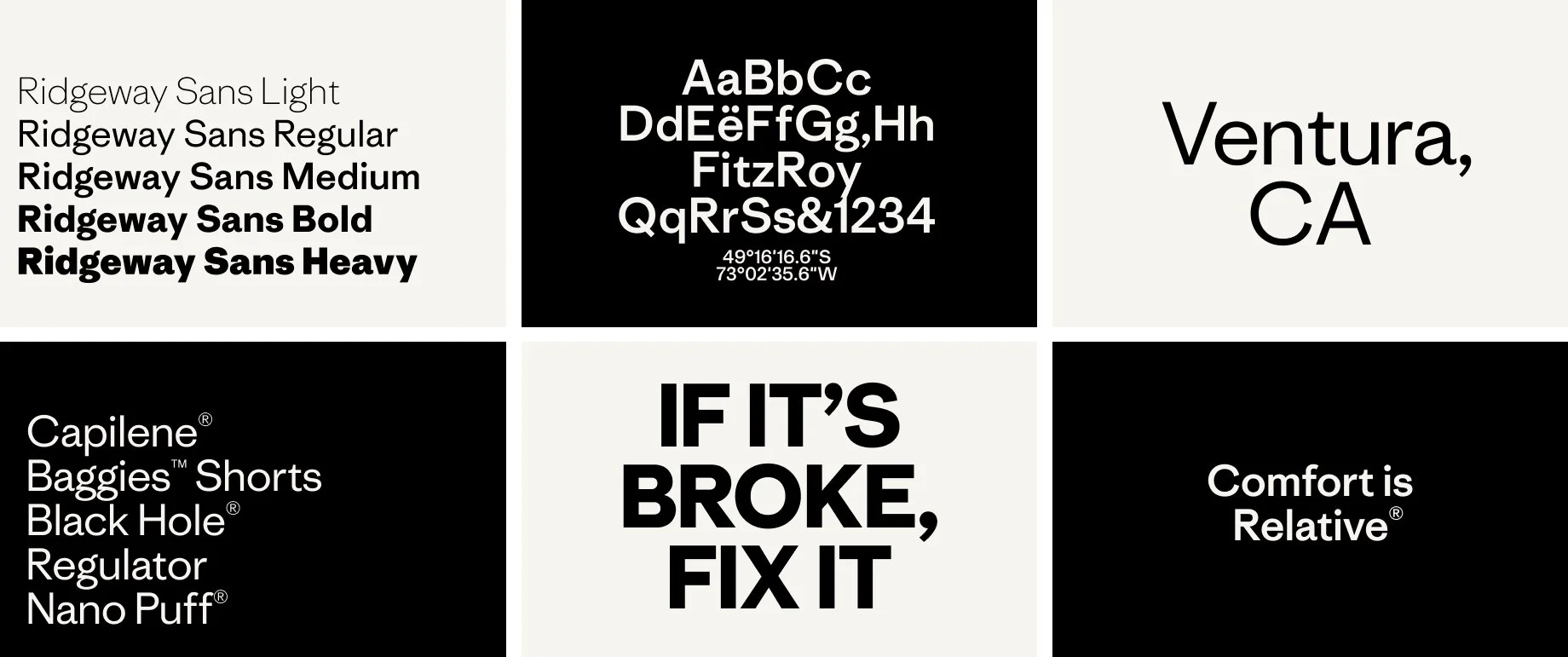
why custom
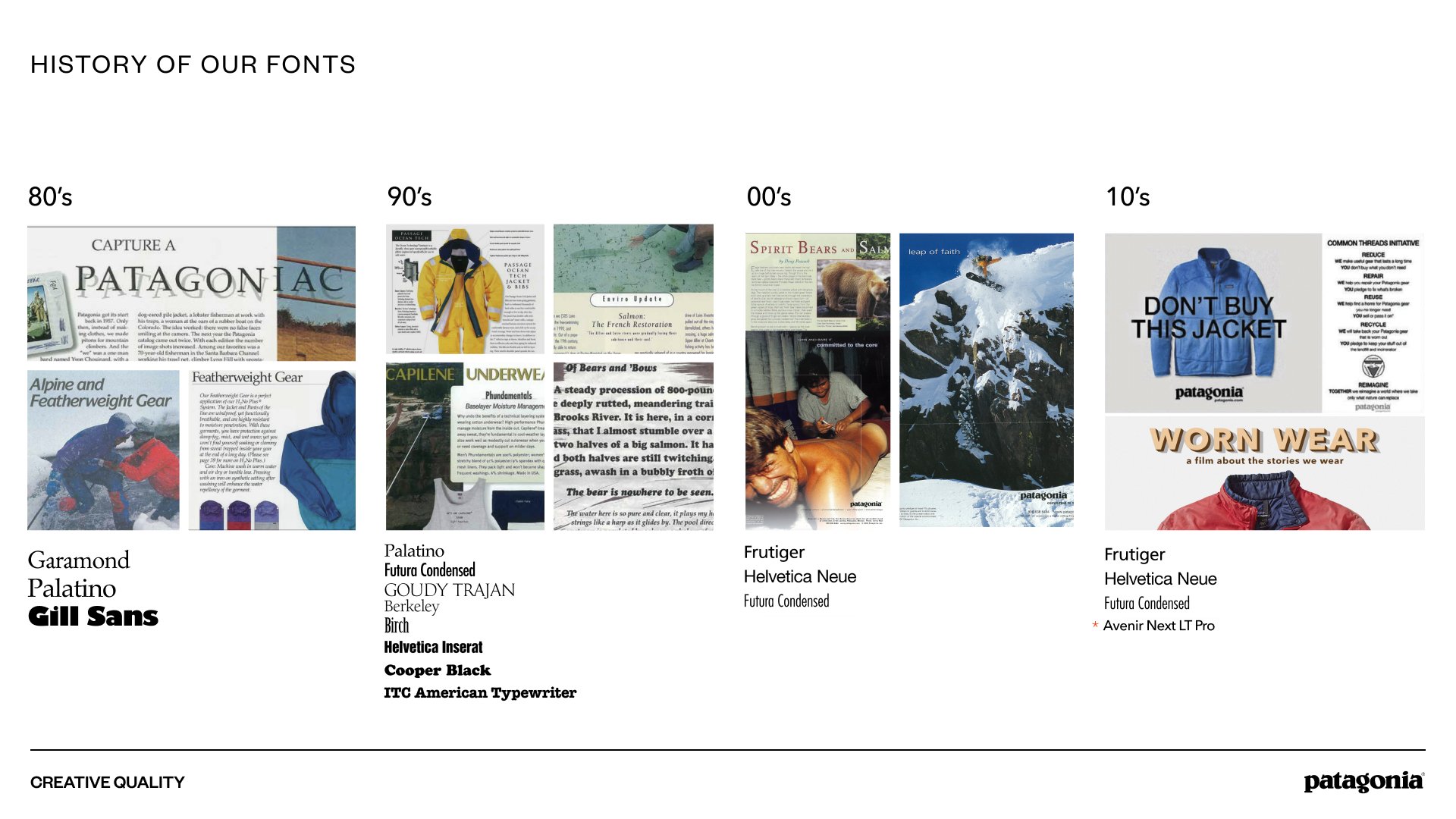
Over its long history, Patagonia has used a lot of different fonts. 10 years ago, Avenir was enough. It felt like the right font at the time because of the of the range of highly functional typefaces it contains across print and digital. It was a perfect kit for the size of the company at that time. It did not express a range of emotions, but it was easy to use and served a utility purpose.
This would cost $120k+ per year, and besides its functionality did not represent the brand identity where it is. This context created a great opportunity to clean up and simplify a legacy font set, have an own able, unique voice for our products and storytelling, and show the highest standards in brand design.
The Designer and the creative process
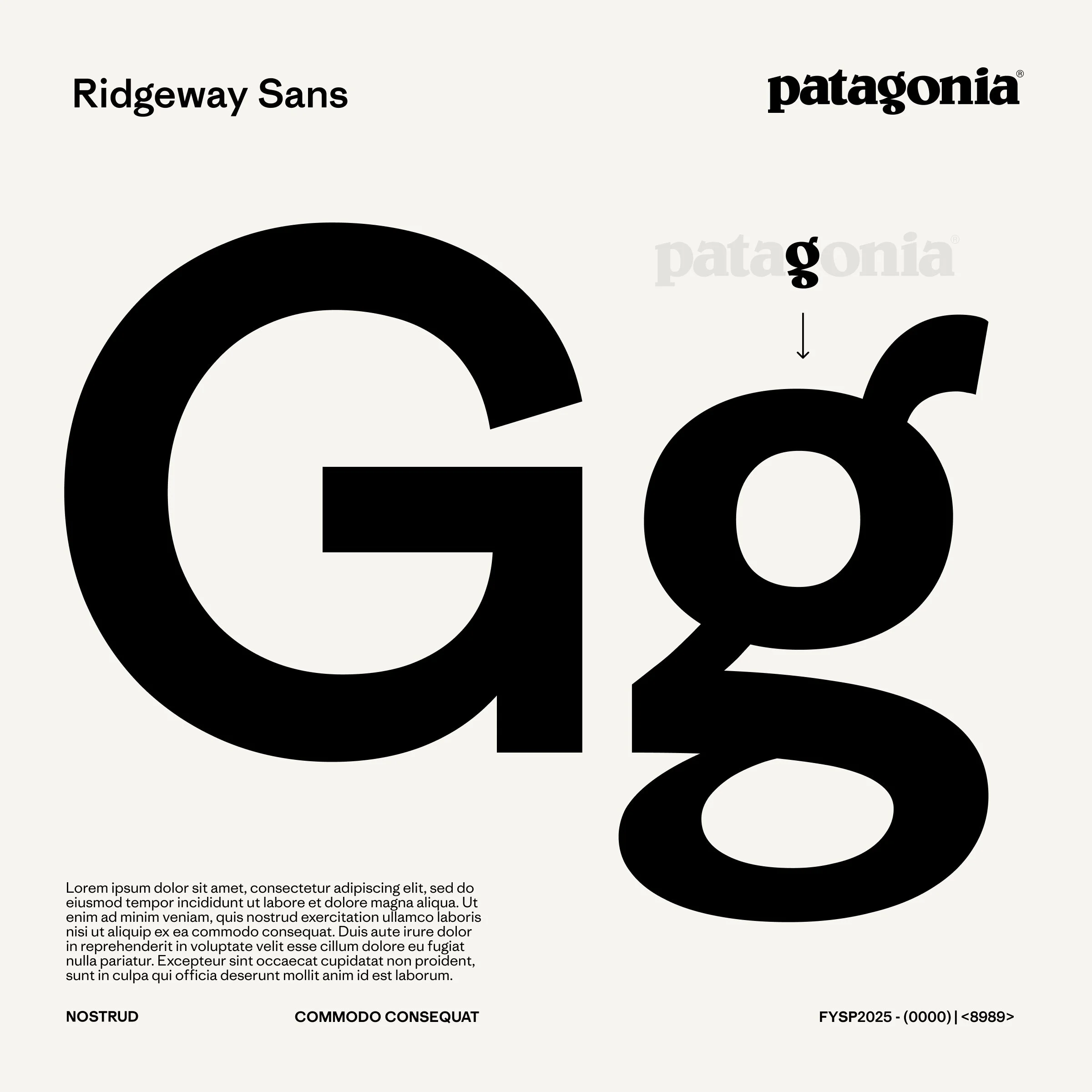
Who better to design our new font than the designer of Copernicus, our serif font? Although Chester was already very familiar with Patagonia, the creative leads brought him on campus for an immersive deep dive into the archive and our design history. In collaboration with our archives leaders, they researched the motives of past creative leaders, to learn why certain moves were made. The result of this exercise was an agreed starting place.
Our final direction...
’Connect to the tone of Copernicus with a more versatile partner font. Be inspired by Belwe, our brand font, but don’t make overly stylized moves we will tire of. It should feel more human than the industrial vibe of Avenir’...
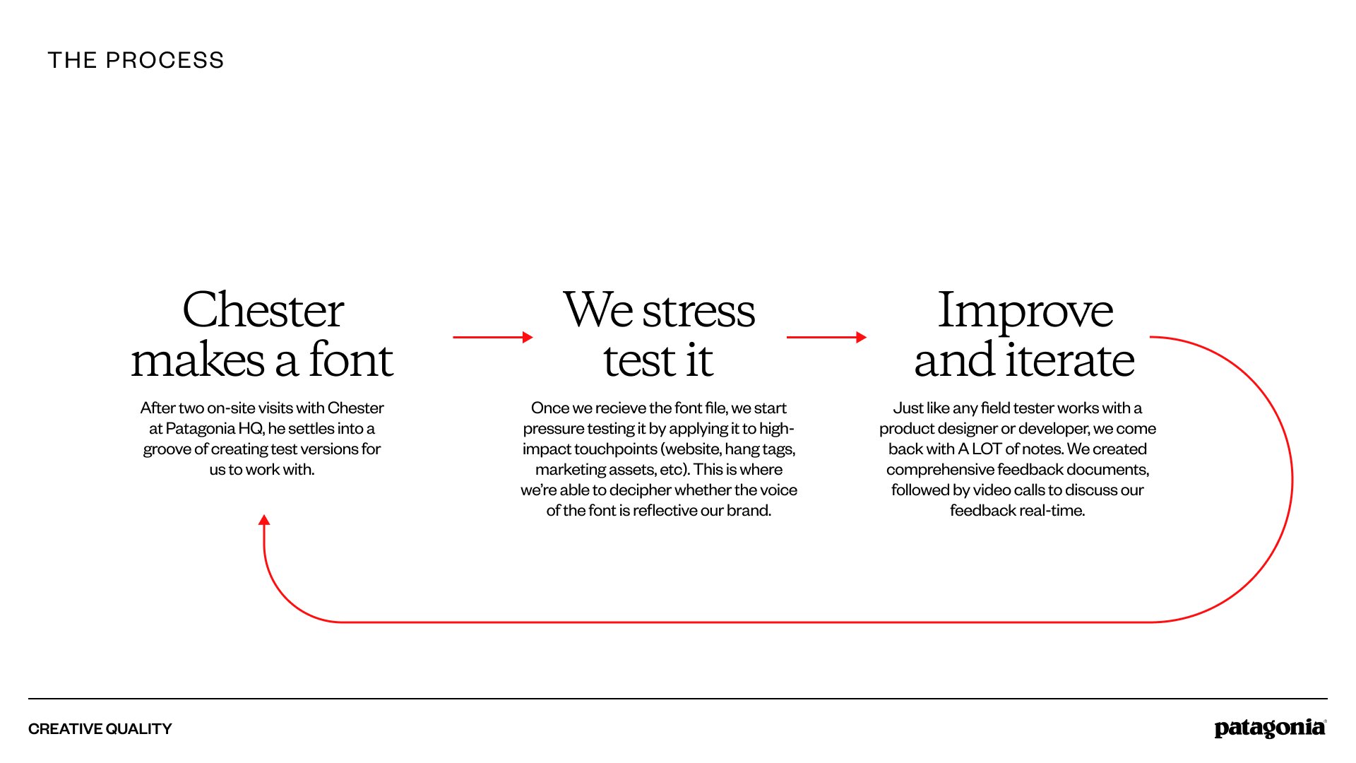
From Font Files to Global Implementation
From the font files to the implementation on Patagonia’s digital properties there was a long iterative and collaborative process that went from stress testing changes and understanding the workflows from the Design System users to the final implementation on the Design System and the code.
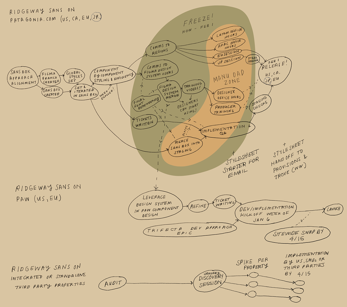
Cool sketch of our process by our Product Manager Sam Levy (also an illustrator). It includes when I became dad for the first time and took some time off :)
Tokenization of Text Styles
As we started working on iterations of the font, and the different weights that we would probably commit to use, I redesigned the system for it to be more easily updated, using three levels of variables and styles, that could later be replicated as tokens in our code’s stylesheets:
The Three-Tier Architecture
I structured our Figma variables to map directly to our CSS/Sass stylesheets, creating a 1:1 parity between design and code:
Primitive Variables (Global): The raw values. These define the "ingredients"—specific font-family strings, pixel scales, and raw font-weights.
Semantic Variables (Alias): The "intent" layer. These variables (e.g., font-size-body-large) point to primitives but define the specific role of the text, allowing us to swap underlying values without breaking the system.
Figma Text Styles (Component Layer): The final application. These styles consume semantic variables and include metadata/descriptions to guide designers on proper usage (e.g., "Use for primary body copy on long-form articles").
Efficiency Through Variable Modes
One of the most significant wins was utilizing Variable Modes to solve the "Mobile vs. Desktop" style bloat.
The Old Way: We maintained duplicate styles for every breakpoint (e.g.,
Heading-L-DesktopandHeading-L-Mobile), doubling the maintenance effort.The New Way: I consolidated these into a single, responsive style. By using Modes, a single style like
Heading-Lautomatically adjusts its scale and line height based on the device container it lives in.
Impact: This structural change reduced our total style count by 50%, drastically simplifying the library for the design team and reducing decision fatigue.
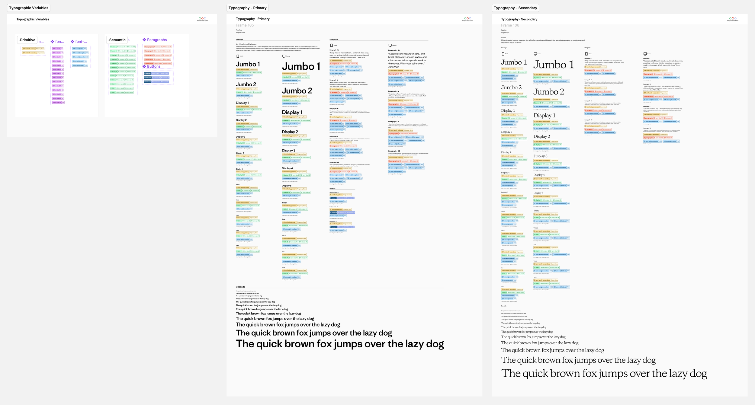
Documentation of Variables and Text Styles in our Patagonia Design System library in Figma
Component-Level Migration & System Refinement
With the token architecture finalized, I led a comprehensive refactor of the global component library to ensure a seamless transition to the new system.
System Refactoring: I systematically re-linked all components to the new cross-viewport styles. While removing 50% of the legacy styles initially broke desktop instances, it allowed me to consolidate the library into a single, responsive source of truth.
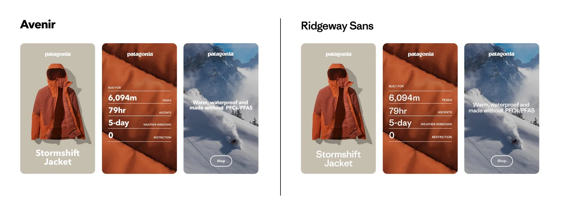
Strategic Visual Refresh: Partnering with the Creative Design Lead, we modernized the visual language by increasing base font sizes and reducing weight variety. This resulted in a bolder, cleaner hierarchy that improved both brand impact and scannability.
WCAG & Accessibility: By increasing the minimum font scale and optimizing line-heights, we significantly improved legibility and ensured the system met WCAG 2.1 AA standards across all digital properties.
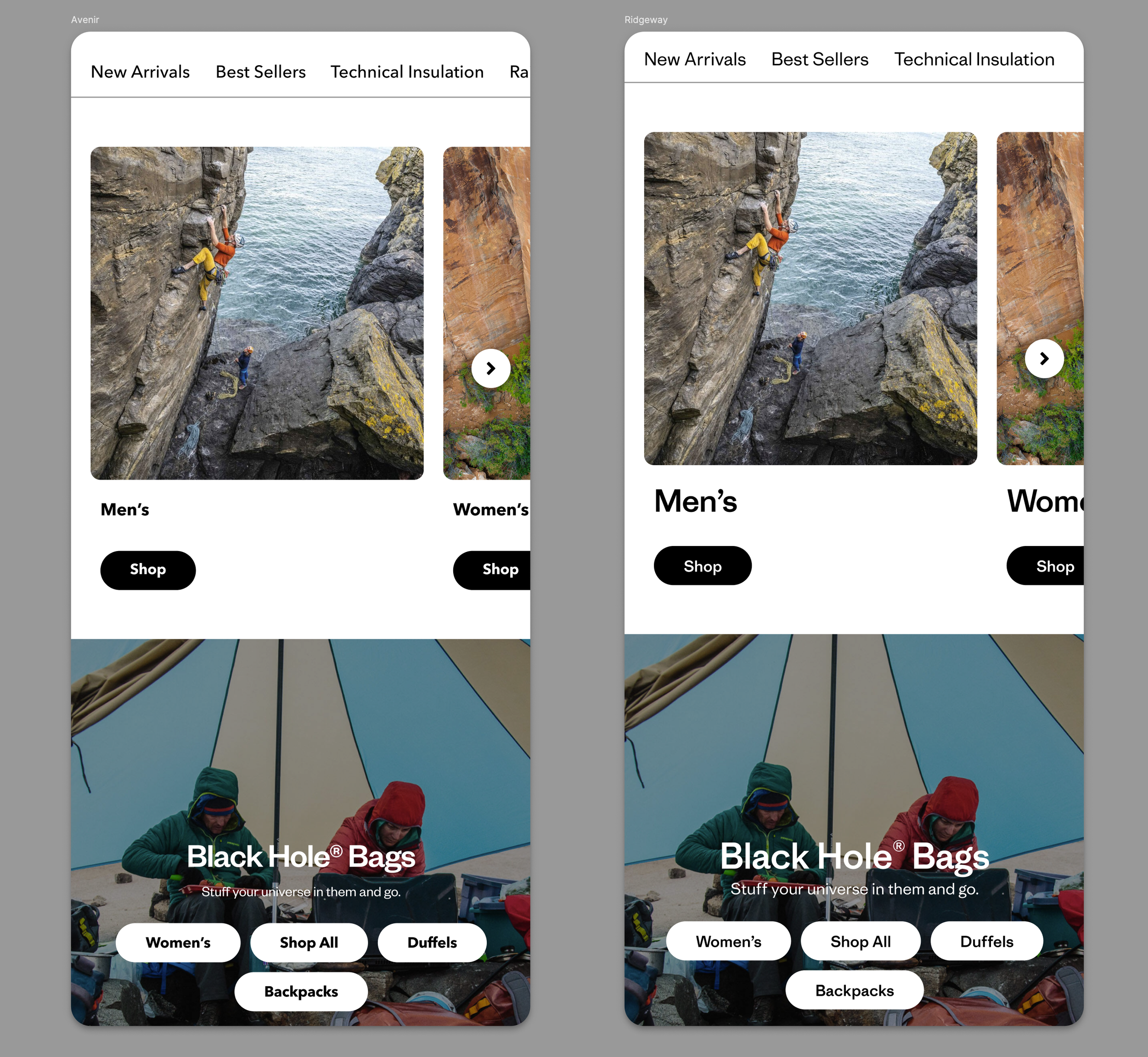
Example of the stress testing the new styles in the Homepage experience using existing components
Bonus: Maximizing Component Efficiency
Since the typeface migration required engineering effort on our core library, I seized the window to address long-standing feedback from designers and producers. We used this deployment to ship high-value usability upgrades that had previously been backlogged.
Case Study: Multi-Link Tiles
I redesigned the Multi-Link Tile component to offer greater flexibility without increasing manual work:
Expanded Styling: Provided designers with more visual options to suit diverse layout needs.
Smart Defaults: Introduced a ‘Content Size’ property that utilizes global defaults. This allows designers and producers to toggle between pre-configured scales instantly, significantly reducing setup time and ensuring system consistency.
The Win: We didn't just change the font; we optimized the workflow for the people using the system every day.
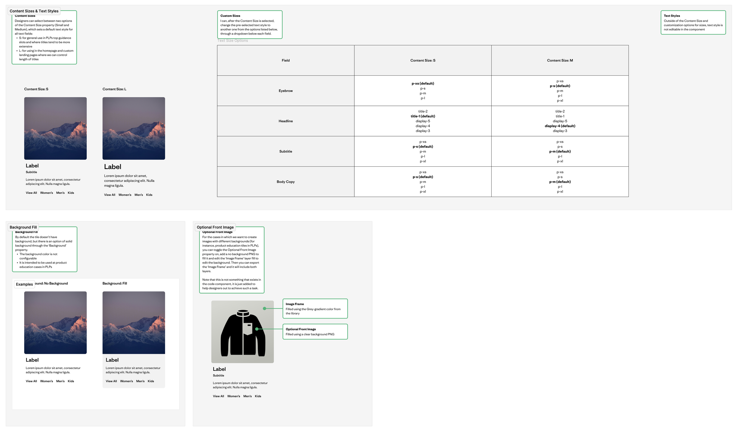
Example of a component that was enhanced: the Multi Link Tiles.
Governance & Global Change Management
Because this migration fundamentally changed how teams built layouts, I pioneered a formal communication strategy to ensure a seamless transition. This was the first time our team moved beyond "shipping" to "onboarding."
Proactive Onboarding: I created video walkthroughs and documentation to bridge the knowledge gap. Post-launch, I hosted Office Hours to troubleshoot in real-time and gather direct user feedback.
Global Localization & Empathy: This process surfaced a critical insight from our Japan team, where the new custom font didn't meet local cultural or functional requirements.
The Pivot: I led the decision to maintain a localized stylesheet for Japan using a more appropriate typeface, proving that a global system must be flexible enough to respect regional needs.
Impact: This approach transformed our delivery process from a "push" to a "partnership," resulting in higher adoption rates and a stronger feedback loop between the system team and regional stakeholders.
Conclusion & Key Takeaways
The migration to a custom typeface was more than a visual refresh; it was a total overhaul of our system’s architecture. By aligning technical execution with human-centered governance, we transformed a potential disruption into a significant upgrade for the entire organization.
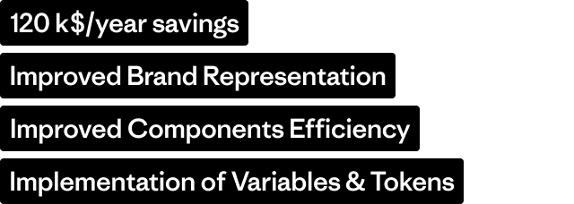
Key Results
Operational Efficiency: Reduced the typography style library by 50% through Variable Modes, drastically lowering maintenance and decision fatigue.
Global Scalability: Successfully deployed a tiered token system across multiple platforms (Salesforce, Shopify, WordPress), proving the system’s resilience in a complex technical stack.
Inclusive Design: Improved digital accessibility by aligning core components with WCAG 2.1 AA standards.
Standardized Governance: Established a new precedent for change management through video documentation and office hours, resulting in the highest adoption rate for a system update to date.
Final Reflection
This project reinforced that a design system is only as strong as its flexibility. By listening to regional needs—such as the pivot for our Japan team—we ensured that the system remained a tool for empowerment rather than a constraint. We didn't just ship a new font; we shipped a more robust, accessible, and user-centric foundation for Patagonia’s future.
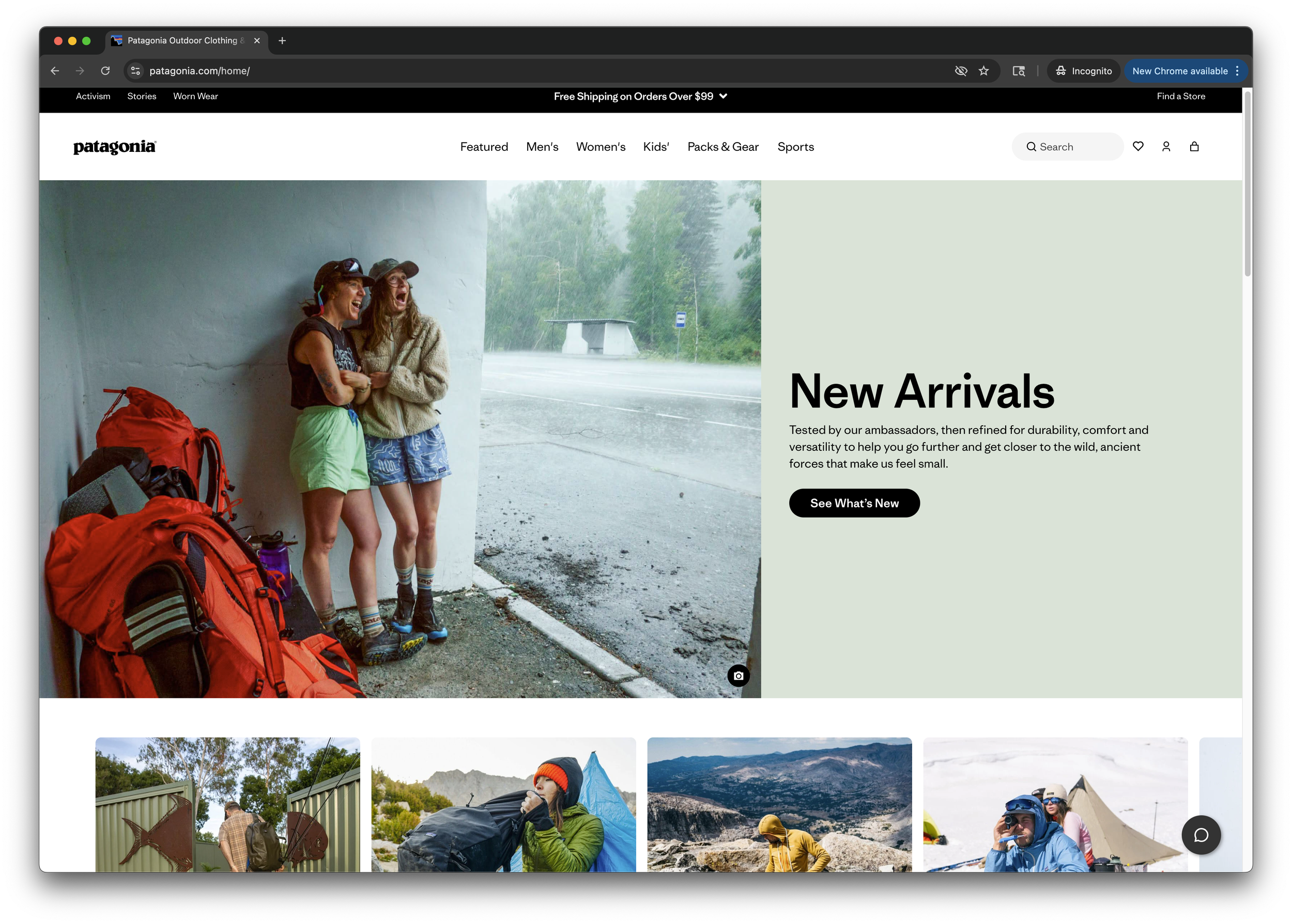
Living example on Patagonia.com